
Branding & Design for a High-End Seafood Restaurant
THE BRIEF
Oro Maris came to us with a clear vision — they wanted to stand out in the upscale seafood scene without feeling cold or unapproachable. They blend global flavors with premium ingredients, and needed a brand that could walk that fine line between sophisticated and welcoming. From the logo to the menus to the signage, they wanted a cohesive identity that felt elevated, but still invited guests to relax and enjoy.
CLIENT BIO
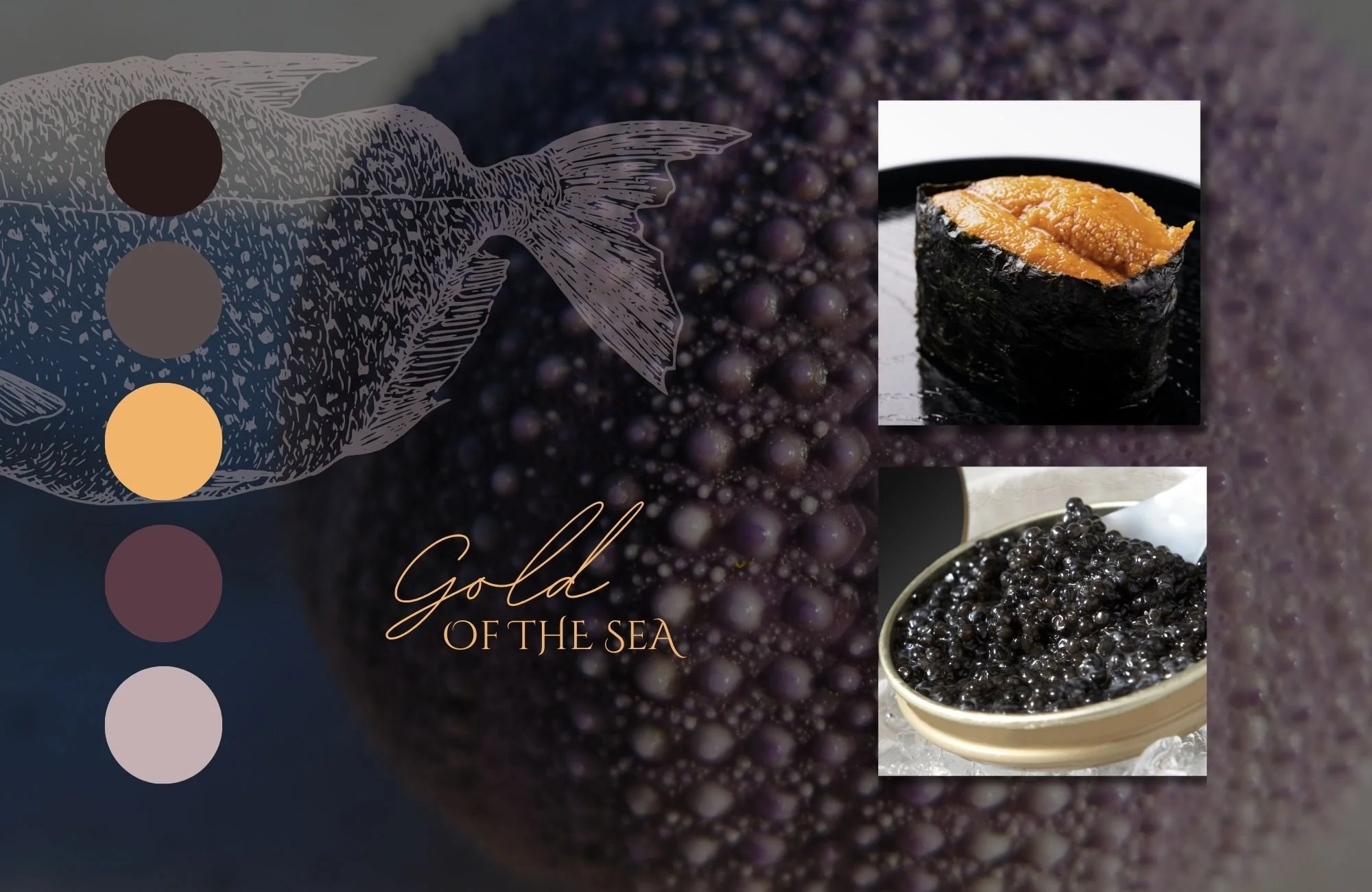
Oro Maris isn’t your typical seafood restaurant. They bring the best of the sea — think oysters, caviar, and uni — and pair it with a globally inspired menu and warm hospitality. They wanted to create a space where seafood lovers could indulge in luxurious dishes without the stuffy fine dining atmosphere. The name itself, Oro Maris, translates to "Gold of the Sea," perfectly capturing their passion for rare flavors, fresh ingredients, and unforgettable experiences.
DELIVERABLES
+Exterior Signage
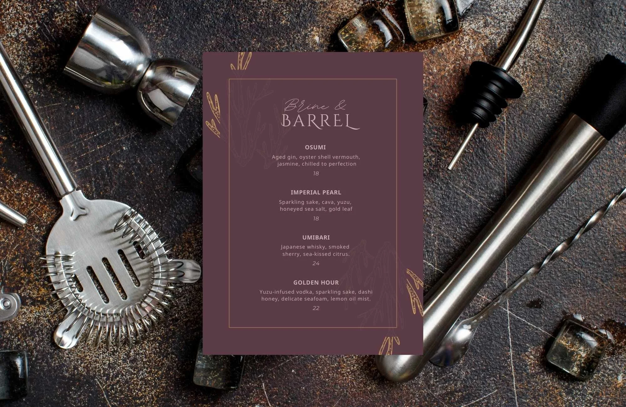
+Menu Design
+Social Media Direction
+Logo Design
+Color Palette
+Visual Identity


The Creative PROCESS
Oro Maris — meaning Gold of the Sea — set the tone for a brand identity that honors the rare treasures of the ocean. We took inspiration from two of the sea’s most prized delicacies: uni (sea urchin) and caviar. Their rich textures, subtle colors, and luxurious associations shaped the design direction, from the deep, moody palette to the refined typography and metallic accents.
But the visual identity goes even deeper. The O in Oro is a subtle Enso, a circular brushstroke symbolizing elegance, balance, and the cyclical nature of life — a nod to both Japanese artistry and the ebb and flow of the tides. The S in Maris hides a fish hook, a symbol of prosperity, strength, and connection to the ocean across many cultures.
Every design element — from the sea urchin-inspired logo to the hand-drawn illustrations — works together to tell a story of reverence for the sea, culinary craftsmanship, and the delicate balance between nature and an elevated dining experience.

Final OUTCOME
The final brand identity feels like a direct extension of the Oro Maris dining experience — refined, intentional, and grounded in the depths of the ocean. The logo, with its sea urchin centerpiece and elegant serif typography, blends organic textures with sophistication.
From menus to coasters to exterior signage, the brand flows seamlessly across every guest touchpoint. Rich, moody colors — inspired by the deep sea, polished shells, and the shimmer of gold — create a sensory experience before the first dish even arrives.
The result? A brand that honors the ocean’s treasures, elevates the dining experience, and positions Oro Maris as a destination for seafood lovers who crave something both luxurious and soulful.


LIKE WHAT YOU SEE?
BOOK YOUR PROJECT
Schedule a call to get started.