
How to Choose the Right Brand Colors (Using a Proven Formula)
Your brand colors aren’t just for looks—they directly impact how customers perceive and remember your business. In fact, research shows that color increases brand recognition by up to 80% [source]. But choosing the right colors can feel overwhelming.
That’s where the 60-30-10 rule comes in. Used by top brands like Coca-Cola, Rolex, and IKEA, this formula helps businesses create cohesive, eye-catching brand identities that drive recognition and trust.
What Is the 60-30-10 Rule?
The 60-30-10 rule is a proven color formula used in branding, interior design, and fashion to create visually balanced color schemes. It works like this:
60% Dominant Color – Your brand’s primary color that sets the overall tone.
30% Secondary Color – A complementary color that adds variety and depth.
10% Accent Color – A contrasting color that highlights key elements like CTAs (call-to-action buttons) and logos.
For example, in branding a luxury hotel, the dominant color might be a calming beige (60%) to represent sophistication. A deep blue (30%) could add richness and depth, while gold (10%) accents convey luxury.

Why This Rule Works
A well-balanced color scheme creates harmony and prevents visual clutter. Studies show that people make subconscious judgments about a product within 90 seconds, and up to 90% of that judgment is based on color alone according.
Examples of the 60-30-10 Rule in Branding
Many iconic brands use this rule to create a memorable and recognizable identity:
1. Coca-Cola
60% Red – Represents energy and excitement.
30% White – Provides a clean, refreshing contrast.
10% Black – Grounds the brand and adds sophistication.
🔥 Why it works: Coca-Cola’s bold red commands attention, while the white and black maintain balance and clarity.

2. IKEA
60% Blue – Evokes trust and dependability.
30% Yellow – Adds warmth and optimism.
10% White – Keeps the design clean and minimalistic.
🔥 Why it works: Blue and yellow reflect IKEA’s Swedish heritage while making the brand bold, friendly, and approachable.

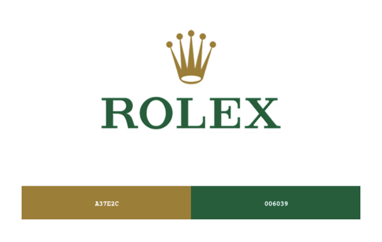
3. Rolex
60% Gold or Silver – Symbolizes luxury and heritage.
30% Deep Green – Evokes elegance and exclusivity.
10% White or Red – Used for text and small accents.
🔥 Why it works: Rolex’s color scheme reinforces wealth, trust, and prestige, perfectly aligning with its luxury audience.
How to Apply the 60-30-10 Rule to Your Brand
Step 1: Define Your Brand Personality
Before choosing colors, ask:
Is my brand playful or professional?
Is it luxurious or budget-friendly?
Do I want to evoke trust, excitement, or calmness?
Example: A tech startup may use white (60%) for a clean, modern look, blue (30%) for trust, and orange (10%) for energy.
Step 2: Choose a Cohesive Color Palette
Use tools like Adobe Color, Coolors, or Canva to test combinations.
Start with your dominant color—it should align with your brand values.
Pick a secondary color that complements the dominant color.
Select an accent color that stands out without clashing.
Example: A skincare brand could use pastel pink (60%) for calmness, sage green (30%) for freshness, and gold (10%) for luxury.
Step 3: Apply It to All Your Brand Assets
Consistency is key! Use your 60-30-10 palette across:
Websites: Dominant color for backgrounds, secondary for section headers, and accent for CTA buttons.
Logos: Use dominant and accent colors for an eye-catching design.
Social Media: Ensure all visuals follow your brand color ratios.
🔍 Related Read: Mastering Your Brand Colors: Proven Tips to Boost Recognition and Impact
Step 4: Test Your Palette with Real Audiences
Run A/B tests on social media ads.
Show prototypes to a focus group or trusted customers.
Adjust colors based on feedback and engagement data.
Common Branding Mistakes to Avoid
🚫 Overusing Accent Colors – Makes designs chaotic and distracting.
🚫 Choosing Clashing Colors – Red + neon green? Probably not a great look.
🚫 Ignoring Cultural Meanings – Colors have different meanings worldwide.
Final Thoughts: Why This Rule Helps Small Businesses
The 60-30-10 rule is one of the simplest ways to create a professional, recognizable brand identity—without needing a design degree.
By applying this formula, your brand will:
✅ Look polished and professional (no more DIY branding disasters).
✅ Be easier to recognize and remember (essential for marketing).
✅ Create a consistent, trustworthy image across all platforms.
🚀 Want expert help with your brand’s design? Let’s craft a stunning visual identity that sets you apart. Contact us today!